
03
Client: Sellers Shield
Status: Complete
New Application
Sellers Shield offers a suite of digital products to support real estate agents’ efforts to collect the forms required from their sellers during the process of selling their home. My first task was to improve the seller application experience.
The application had been slowly migrating users from a 2.0 experience to a 3.0 experience. The 3.0 experience dramatically underperformed and before we could finish migrating all of the users the 2.0 and 3.0 the performance of the applications had to be consistent. 3.0 had to become 3.1.
Discovery

Audit. I audited the two experiences to find out what exactly the differences were.
I identified experiential differences and opportunities to improve the 3.0 experience. I prioritized my improvements and created a roadmap with our leadership team to design, validate, develop, and implement them.
Initial Observations:
Lack of consistency in branding, colors, typography, and components
Interstitial frustration from long wait times and unnecessary steps
Non-sequential navigation and few calls to action makes the platform unpredictable and confusing to the user
Poor feedback when errors occur creating anxiety for the user

User Interviews. Interviewed users via Google hangout to collect data. Interviews didn’t exceed 30 minutes and informants were compensated for their time.
Findings were categorized by frustrations, product opportunities, marketing opportunities, general observations, and further investigation.
The findings in the interviews validated the results of the initial UX audit. Planning of the design and UX improvements began.
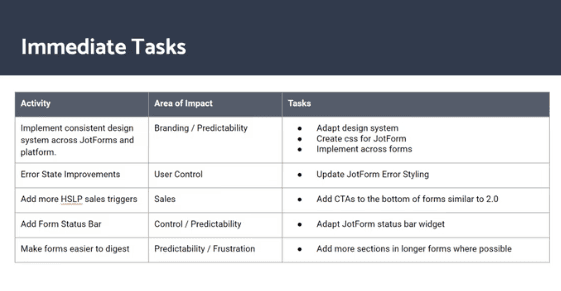
Planning. Improvements were categorized by their potential impact and complexity (time to implement).
Tasks included:
Improvements to the brand and product presence
Logos
CTAs
Consistent brand elements
Additional controls and feedback given to the user to mitigate anxiety and improve predictability:
Progress bars
Fewer steps in process
Visual feedback
Consistent components
Design
Design System & Pattern Library. The visual design was improved by creating a new design system (using the Bootstrap 4 framework) based on the new company brand the marketing team had developed. The marketing brand guidelines were adapted to conform to WCAG best practices.
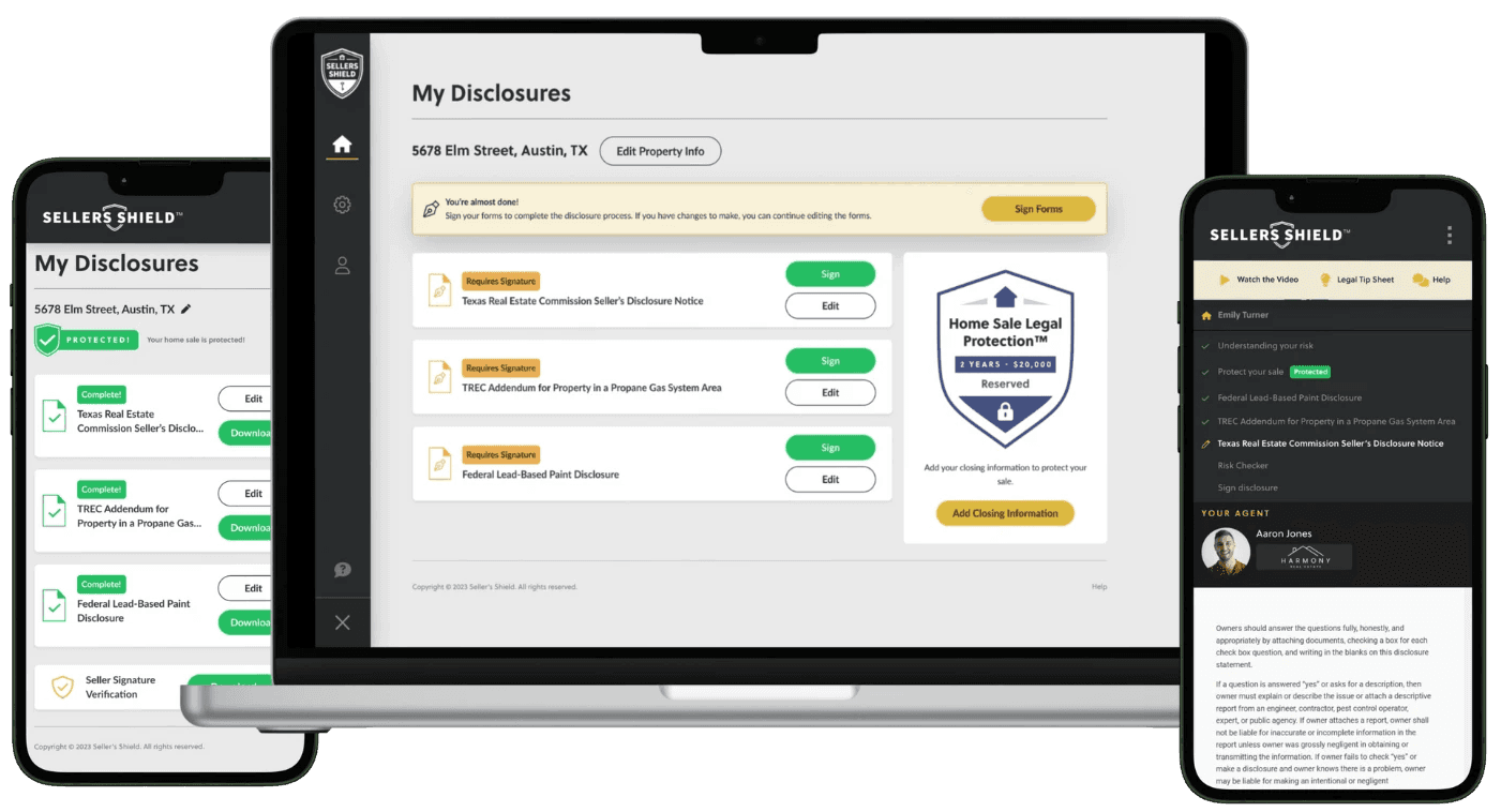
Custom Form Designs. Our forms are managed by a third party application, JotForm. I designed and used a combination of html/css/javascript to customize the forms to be consistent with the rest of the experience. Additionally, I added animated elements to the tool tips.
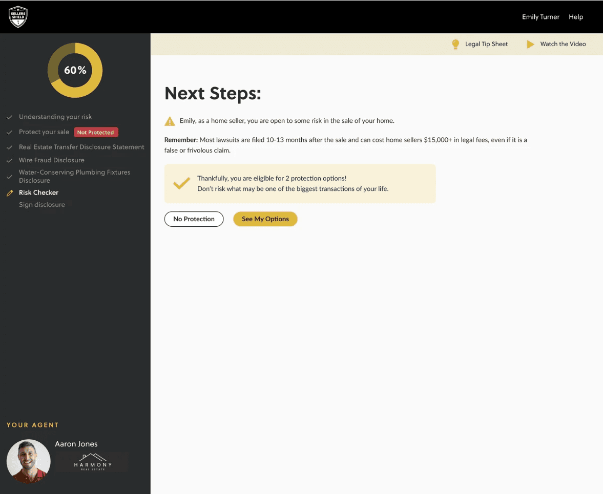
Progress Tracker. This feature allowed users to monitor their percentage completion in real time as they filled out forms, adding transparency to the process and helping users stay motivated to finish.
Faster Onboarding. The original user onboarding process included five steps of information gathering which led to user dropoff and negatively impacted their experience. I redesigned the onboarding experience to reduce the steps from five to two, making it faster and more intuitive for new users to get started.
Results


The designs were implemented in August 2023. Since their implementation, the average monthly completion rate of the forms has increased by 14% and conversion rate has increased by 13% relative to previous performance.
The updated design system has increased consistency between the app and the marketing team’s materials as well as made design hand-offs more efficient.
Customer service complaints from users getting lost in the process have decreased.
Design is an iterative process. New features are constantly being added and improvements made throughout the experience.